Le Corbusier, a Swiss-born architect, had an interesting way of viewing “modern architecture”. He set his style view on Purism, which meant the use of pure geometries that were found mostly in paintings. He opposed the style of Cubism because it was too decorative; as a result, he went back to using basic simple geometries, and embraced its beauty by incorporating modern technology into it. Looking at his earlier to later works would show his development phases for the Purist movement.
Since every architect had their own theory that they followed for their lifetime design, Le Corbusier invented his own guide of designing “modern architecture”, and the guide was the “5 points of architecture”. The five points included: The pilotis, free facade, free plan, horizontal ribbon windows, and roof garden. He incorporated these steps into all of his works, but as the design period modernized, he developed the way of incorporating the “5 points of architecture”. Besides experimenting with his own theories, he also liked to play with proportions, like the Golden Section. With this, he experimented with different forms.

http://www.greatbuildings.com/gbc/drawings/ozenfant_plan_2.150.jpg
Looking at Residence of Ozenfant (1922), one could see the strong geometry of a rectangle, and towards the north, he angled the west wall to create the free plan. Looking the section drawing of this project, one could see how he incorporated the “5 points of architecture” into the building. He used the pilotis for the entrance. The support for the pilotis contained thin columns. The whole structure were supported also by thin columns. For the facade, one could see the horizontal ribbon windows incorporated into it, and how the facade looks free because of the placement of the windows. The placement of the windows allowed a lot of amount of natural light into the building. Instead of doing a slanted roof, he added a roof garden. His reason for it was that the first floor exterior does not have any green areas and the building itself took the green space, so to make up for the lost, he added the roof garden. This also allowed the roof to be seen as a ground level.

"Pavillon Suisse" - Le Corbusier

"Pavillon Suisse" - Le Corbusier
For Pavillon Suisse (1927), one could see there were a few changes to his theory. Instead of using thin column supports, he used a massive concrete reinforced support to support the pilotis. The proportion of spaces within the building were different from the previous work. From that, one would notice that he was not very consistent on proportioning the spaces. It seemed he used the “5 points of architecture” to decide the proportion of program spaces. This project also had the free plan, free facade, and a roof garden. The window were a little different. Instead of the long ribbon like windows, he transformed the style to continuous curtain walls. Also, the use of new technology had the affect on the way he designed, concrete and steel.

"Villa Savoye floor plan" - Le Corbusier
The later project of his, Villa Savoye (1928), showed that he went back and forth with what he considered “modern architecture” was. In this project, instead of using massive support, he went back to using thin column support. This project was actually based on Picasso's painting of a guitar, so the interior plan were very free and flowing. The facade was also free along with the ribbon windows. For this project, if one studied the form and the floor plan, one could see that this project's form was very similar to boats. The reason for that was at that time, he was extremely obsessed with cars and boats, and how they functioned. Also, then roof garden's curvilinear form was used to break away from the stiffness of the square form below.
After knowing about Le Corbusier, let us look at Alvar Aalto, and how he defined “modern architecture”. Aalver Aalto was a functionalist that viewed architecture solely on the purity of form, how the climate should affect the way that architecture should be designed, and the use of industrial materials. In addition to his functionalist way of thinking, what made him special was the organic forms that he used to design furniture and buildings.


"Experimential House" - Alver Aalto
"Experimental House" - Alvar Aalto
One of his earlier project, the Experimental House (1952), he studied how a group of bricks can be organized into many different possibilities of patterns and forms. He designed the slanted roof based on the direction and angle of the sunlight. He made the ground plan and the wall plan seemed as one because there were not sign of exposed foundation, instead, there were all bricks. He used the material wood to get away from too much brick. The other reason of using brick was to show that even on a modern architecture, bricks could be used to make the building look aged.


"Baker House" - Alver Aalto
"Baker House floor plan" - Alver Aalto
The Baker House (1947) was designed for students at MIT. Although this project was a little earlier than the Experimental House, it seemed as if it was more modern than it. For this project, Aalto drew a wavy line and placed the programs into the curvilinear form. He was able to separate private and public with that form. Looking the floor plan, one could see that each space are not the same sizes, and that was what he considered the purity of form (going with the nature of curves). The facade of the building was unique. The stepping up and down of the facade design was sending the message of how the building would communicate with the sky and the ground. Also, it would guide the user to the entrance of the building. This design created an illusion that this building had a pilotis, which was Le Corbusier's theory, but it does not. Again, he used brick for this project, and by now, viewers would know that Aalto liked to work with the material brick.


"Essen Opera Concert Hall" - Alver Aalto
"Essen Opera Concert Hall section" - Alvar Aalto

"Essen Opera Concert Hall floor plan" - Alvar Aalto
Alver Aalto ARCH 329 Power Point
The Essen Opera Concert Hall (1988) was a big change in Aalto's original way of designing. Instead of using brick materials, he begun to use concrete and steel. He still incorporated the curvilinear form into the design. The facade of the building was very well designed. The facade design was of a music score with notes. This exaggerated about the usage of the building, which was the purpose of Aalto's design. His facade seemed free and flowing; however, the interior was a bit more rectilinear than curvilinear; however, he was intelligent on how he define the main space of the building. To define the main space of the building, curves were used instead of rectangular forms, this also break away from the stiffness of using straight lined walls.
For Mies van der Rohe, his design theory requirements were not as long and were straight to the point. He was a functionalist and a constructivist, and he was able to show these qualities through most of his buildings. His theories for designing a “modern architecture” were “the enclosure of function in a generalized cubic container not committed to any particular set of concrete functions” and “the articulation of the buildings in response to the fluidity of life” (ARCH 329). To add on to his love for life, he used repetition and symmetry to emphasize it.

"Wolf House floor plan" - Mies van der Rohe

"Wolf House" - Mies van der Rohe
Take Wolf House (1925) for example, Mies van der Rohe took a square or rectangle and repeatedly stack it, rotate it, and put it together to create the form of the Wolf House. Looking at the floor plan, one could see the repetition of the square or rectangular form put together even more obviously. Besides the repetition of the form, then most special design part of the building was the brick facades. When looking at the building, one may think that the building was completely brick; however, the secret the lies within the brick facade layers. Wolf House was actually a steel structure, and the brick was added to hide the steel structures. Why did Mies van der Rohe hide the steel? The answer was unclear. One may assume that just like Aalto, Mies van der Rohe wanted the building to be viewed as an old building, even though the materials used were completely modern.

"Brick Country House view and floor plan" - Mies van der Rohe
Looking at Brick Country House (1924), one could observe an obvious architecture development that Mies van der Rohe made. In his floor plan diagram, Mies van der Rohe displayed the less use of hard surfaced walls to support the building, instead, more glazing were installed so the users can see the captured views that he set for the users to see. Also, that designed was a further development from the Riehl House. The form of the building was created by using repetition of square and rectangular forms, and the floor plan diagram showed this repetition a lot more stronger.

"Barcelona Pavilion floor plan" - Mies van der Rohe
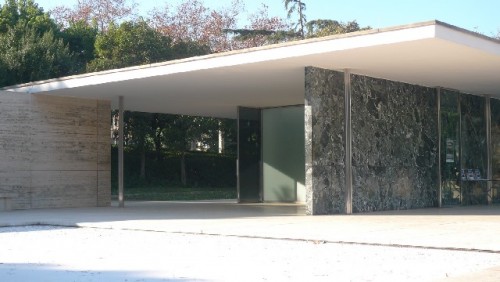
"Barcelona Pavilion" - Mies van der Rohe
The Barcelona Pavilion (1928) really showed his development from using a lot of wall structure to less wall structure and more glazing. From this point, Mies van der Rohe just used the walls as a column replacement. Since the the support for the building was enough, Mies van der Rohe used this opportunity to use thin steel structure and glazing to make the building look as if it was floating. The placement of the glazing framed viewed that he wanted the users to see. The reason for him wanting the users to see the nature was that he loved nature, and thought that it would be very healthy for the users to connect with it. The glazing adds the connecting feature more powerful since the user will feel as if they were still outside even when they are inside the building. This project was Mies van der Rohe's definition of “modern architecture”, purity, the use and experiment of modern materials, less decoration, and embracing the naturalness of the materials.
Even though all three architects had completely different designs; however, they all had a few similarities, which were seeing the purity of the simple forms, modern materials, and the nature. Le Corbusier, Alvar Aalto, and Mies van der Rohe all viewed “modern architecture” with open mind, and were all willing to experiment with the new technologies, which made “modern architecture” a lot more meaningful. Also, to help simplify their definition of “modern architecture”, each of them invented their own theory or guide for the best way to design “modern architecture”.
__________________________________________
Middleton, Deborah. "Mies Van der Rohe: Houses 1930s-1950." Ball State University. ARCH 329. 1 Nov., 2011. Accessed 7 Nov., 2011. PPT
__________________________________________
Middleton, Deborah. "Mies Van der Rohe: Houses 1930s-1950." Ball State University. ARCH 329. 1 Nov., 2011. Accessed 7 Nov., 2011. PPT


