When Van de Velde wanted to “eliminate the distinction between the craftsman and the artist, Loos saw the split between them as irreversible”[1]. Loos saw differences between them. Loos' way of ornamenting an architecture was not by molding images or forms onto the materials, but by using just the materials. He embraced the natural beauty of the materials, and thought that if it was to be manufactured into an ornamented piece of art, then it would be a waste. According to his essay, Ornament of Crime, manufactured ornaments was a waste and took too much labor. This essay was aiming to despise Art Nouveau, Jugensdtil, and Werkbund movements.
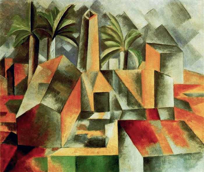
One of his project, Loohaus, was aim to illustrate how using less manufactured ornaments on the surface of materials could still be beautiful. His design was influenced by Picasso's art work and Cubism. Loos took the geometries within Picasso's work and incorporated it into his architecture. When looking at the Loohaus, one could see that 1.) he used materials to express its natural beauty, and 2.) he added mirrors on the wall to abstract and replicate the geometry forms to create the feel of Picasso's art work.

Rolph Loos: “Loohaus”
Pablo Picasso: “Cubism”
Website: http://www.artyfactory.com/art_appreciation/art_movements/art%20movements/cubism/picasso_cubism.jpg
For his private house, he incorporated the Cubism style into the spaces. His design style was unique and different from all other architects back then. Instead of drawing “plans, facades, or sections...the ground floor, first floor does not exist.... There are only interconnected continual spaces, rooms, halls, terraces...” [2]. He did not like to work with flat planes. He favored the idea of creating hierarchy interior spaces of heights for functionality. His project, Villa Muller, would be one of the best example for his favorite way of designing. The spaces within Villa Muller were all different, but were connected. Although Villa Buller's interior spaces seemed to all connect, Loos was still able to separate the public and private spaces.

Rolph Loos: “Villa Muller”

Diagram of Enclosure
At the Weissenfhofsiedlung Exhibition of 1927, a member of the Werkbund, Peter Behren, designed his house, House 31, using terraces and hierarchy of spaces. This design was similar to Loos' Scheu House. Both of the designers used terraces; however, the usage of the terraces were different. For Behren, he was studying how ventilation could benefit the user's health. His believed that “In order to make some impact on tuberculosis, it is apparent that every dwelling, even in a multistory building, needs to have a sizable space open to the sky.” [3]. Loos' Scheu House, on the other hand, did not open up to the sky, the structure was enclosed because he wanted to protect the user, and to create an obvious separation of public exterior and private interior spaces.

Diagram showing how the layers were stacked, and how Behren planned out the location for his terraces.
The exterior facade for House 31 was very similar to the facade of Loos' Scheu House. Both designers did not use overly ornamented materials; instead, they allowed the material to express its natural beauty. Also, the form of the structure were very cubic-like, and seemed as if the spaces were compact.

Peter Behren: “House 31”

Rolph Loos: “Scheu House”
Another member of the Werkbund, Victor Bourgeois, designed the House 10 at the Weissenfhofsiedlung Exhibition of 1927. The floor plan that he had developed was similar to that of Loos' floor plan for Scheu House. There were three main spaces within the house.

Programtic Diagram


Adolf Loos: “Scheu House Floor Plan”
Website: https://blogger.googleusercontent.com/img/b/R29vZ2xl/AVvXsEjq65SzVlbjTsKVQ3eHI0dhIo5GiGgdPww5UFkUYwl17UeS9RDJM0VY93jJ9Oe0D8JHreHRoH7s_Lc7aHj8HieQoeF43wwRDoQ-wOG-2jOKLR775rSlHPXSW0Omn7h1dtNrYTmmF3E7fviM/s1600/scheu.jpg
For Bourgeois, the three spaces were divided for programatic purposes. The blue area highlighted the area of transitional spaces: the hallway, main vertical transition, and the entrances to the house. The pink area highlighted spaces that were semi-public areas, which included spaces that protected the users from the climate. The orange area highlighted spaces that were private, and those included bedroom and bathroom.
For Loos, the three spaces were divided for defining the load-bearing walls. Which also defined the hierarchy of spaces to create visual interest and functionality. The Kitchen and bathroom area seemed to be the less important area, so the space was compact. The Dining room and the transitional space seemed a bit more important, so the space was bigger than the first space. As for the least compact space, those spaces were more important, and it included the upper level of the house.
Although the three designers had different aspect on what the modern architecture style should be, they all had a few similarities in their design that they borrowed from the precedences of previous movements and designers. The use of new technology was very common; as a result, this brought them to a competition on who was the best at developing modern architecture out of them, and the result came out as infinite possibilities.
[1] Colquhoun, Alan. Modern Architecture. Pub 2002. Oxford University Press. p 74-80
[2] ARCH 329. "Adolf Loos". Powerpoint.
[3] Kirsch, Karen. The Weissenhofsiedlung. Rizzoli International Publications Inc. Published 1989. p 178.


